My concentration is about rearranging the same basic motifs to create each an individual image, and how they interact with each other based on the formal elements of art.
Tuesday, April 23, 2013
Concentration Statement 2nd Draft
1. What is the central idea of
your concentration?
2. How does the work in your
concentration demonstrate the exploration of your idea? You may refer to
specific images as examples.
When I was placing the pieces of paper drawn with black marker on the floor, trying to find the perfect arrangement, the columns of stripes
surprisingly reminded
me of visualized DNA gel electrophoresis. Because of how different and unique each arrangement turned out, I began to think
about the
possibility of a changeable composition, which eventually became my
concentration idea. Abstract Expressionism, especially the works of Mark Rothko, had a big influence on the use of stripes. Ellsworth Kelly and the Color Field also inspired me to use bright colors in simple patterns. The act of arranging these stripes and colors was a study on the principles of design. The patterns created a flow to the eye through repetition, balance, and harmony.

Monday, March 4, 2013
Concentration Statement 1st Draft
1. What is the central idea of
your concentration?
2. How does the work in your
concentration demonstrate the exploration of your idea? You may refer to
specific images as examples.
My concentration is about moving the same
pieces of material and placing them in different positions, forming new images
every time.
Originally I planned to use the small
pieces of paper drawn with black marker to create a single image with straight
lines. As I lined them up on the floor, the columns of stripes surprisingly reminded
me of visualized DNA gel electrophoresis. At the same time I played around with
the papers’ placement to see which way looked best. I began to think about the
possibility of a changeable composition, which eventually became my
concentration idea. I chose to use three kinds of medium: marker, watercolor,
and fabric. With black marker I drew straight, sharp lines and angles. With
watercolor I emphasized on color and went for organic patterns. Since fabric is
a very flexible material, I want to experiment with this quality. Instead of one-sized rectangles I used various-sized pieces. I tried techniques such as folding and weaving that look very different from what paper can do.
Monday, February 18, 2013
Blog Entry: John Currin


Tuesday, February 5, 2013
Blog Entry: Dong Yang-Zi


I feel like she really took the forms of our characters and executed them like no other. Her brush strokes are natural and flowing but very powerful. A lot of her works are almost abstract. Her composition was influenced by Western art as a result of her studies in America. She likes to write large on huge papers.

There is a story about a famous, ancient Chinese calligrapher, Wang Xi-Zhi, who washed his brushes in a lake beside where he lived. He practiced writing so much that the water of the lake turned black and could be used as ink. It was also said that he was obsessed with geese and learned to write from the way geese swam.
One of his son, Wang Xian-Zhi, who was also a calligrapher, had another interesting story. The little Xian-Zhi wanted to surpass his father. He worked extremely hard and used up three vats of ink to practice. He finally wrote the character "big" that he felt very proud of and showed his father. His father saw it, grabbed a brush, and added a tiny stroke, thus changing the character to another word. Xian-Zhi then showed the word to his mother, who commented, "My son used up three vats of water practicing, but only this dot resembles Xi-Zhi."
One can only imagine his face upon hearing that criticism.
Dong Yang-Zi was once part of this art show that took reference from the stories. They literally filled a lake of ink.

Here are some more of Dong Yang-Zi's works that I love.


Sunday, January 27, 2013
Blog Entry: Desire Obtain Cherish
 |
| Desire Obtain Cherish, Designer Drugs, 2012 |
From the 2013 LA Art Show. The artist calls himself Desire Obtain Cherish (DOC).
This particular collection is called Designer Drugs.
The idea is genius. Designer drugs are recreational drugs created, usually by modifying the chemical structure of existing drugs, to avoid drug laws.
The artist had a very clever play on words. "Designer" here is fashion design brands and by comparing brands to drugs we get the message instantly.


For more photos: Desire Obtain Cherish
Monday, January 21, 2013
Blog Entry: Roberto Ferri
robertoferri.net
I stumbled across this Italian artist on the web. He is deeply inspired by Baroque painters, especially Caravaggio. His paintings are reminiscent of Baroque paintings but the subjects are often very sexual and violent and many times surreal. His human figures are often in such stretched poses that they look almost distorted.
 They are actually distorted sometimes.
 He also includes a lot of mythical elements in his paintings.


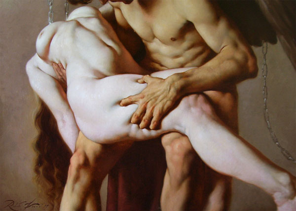
I stumbled across this Italian artist on the web. He is deeply inspired by Baroque painters, especially Caravaggio. His paintings are reminiscent of Baroque paintings but the subjects are often very sexual and violent and many times surreal. His human figures are often in such stretched poses that they look almost distorted.


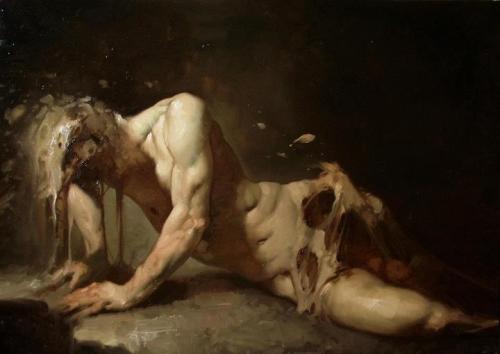
Monday, January 14, 2013
Blog Entry: Abstract Expressionism
I worked on something recently that consists of many pieces of paper with black stripes. When I laid them out on the floor and lined them up, it looked something like the DNA gel electrophoresis.
 Thanks to my sister who talked about northern blots and southern and western blots that whole day. But she also said my work reminded her of abstract expressionist paintings, which then reminded me of how Mrs. Jones told me to look at Mark Rothko. So I checked out some rad expressionist art and impossible hard-edge paintings, and their history. I know we will get to this part in our art history class, but I just love to study these things on my own.
As a result I learned that expressionism started in Germany in the 1920s with films like The Cabinet of Dr. Caligari (1920).
 The abstract expressionism movement later however was American. The term was first used in the U.S. to describe the works of Wassily Kandinsky (whom I really like).

As a result I learned that expressionism started in Germany in the 1920s with films like The Cabinet of Dr. Caligari (1920).
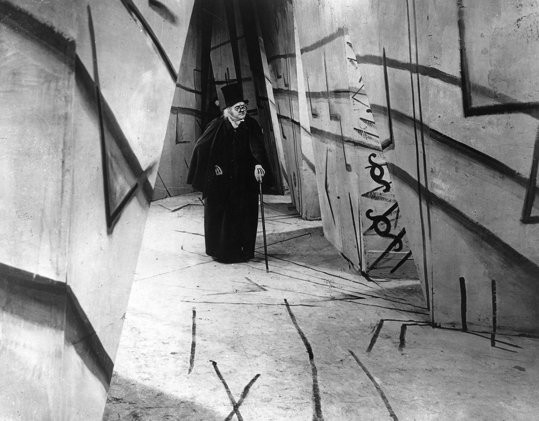
 |
| 1925, Yellow-Red-Blue |
It's interesting that the predecessor of abstract expressionism was surrealism, because of its emphasis on the spontaneous and automatic creation process. There came the action paintings; most famously Jackson Pollock.
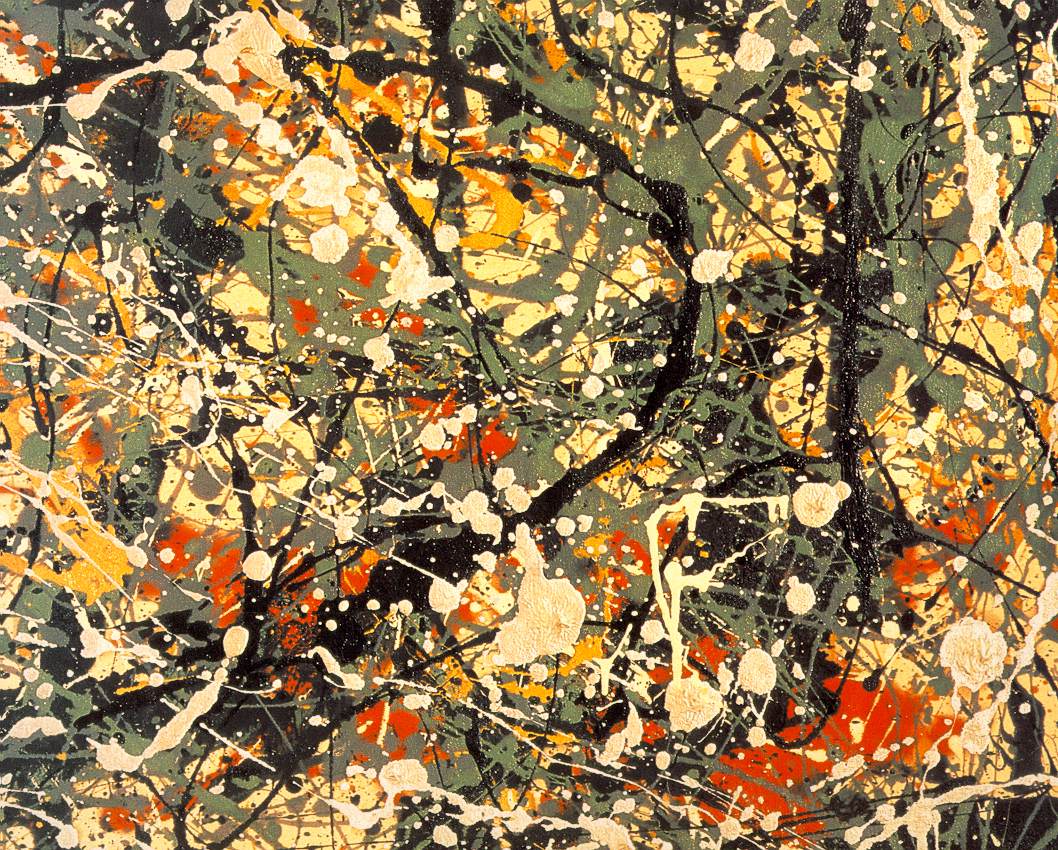 |
| 1949, Number 8 |
Then there was Willem de Kooning and Hans Hofmann. And after them we get color field paintings which include Barnett Newman, Mark Rothko, etc.
 |
| Barnett Newman, Onement 1, 1948 |
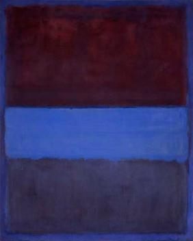 |
| Mark Rothko, No. 61 (Rust and Blue), 1953 |
I really wish I could write more but apparently I've spent too much time on this, neglecting my other homework.There is a whole lot more about expressionism. Reading about art history is so much more exciting than solving math, just saying.
Subscribe to:
Posts (Atom)